Every
semester, we read part of Anne Lamott’s Bird
by Bird in our URI writing classes. We read the first part of chapter two, (called
“[Crappy] First Drafts”). Here’s what she says:
All good writers write them. This is
how they end up with good second drafts and terrific third drafts. People tend
to look at successful writers, writers who are getting their books published
and maybe even doing well financially, and think that they sit down at their
desks every morning feeling like a million dollars, feeling great about who
they are and how much talent they have and what a great story they have to
tell; that they take in a few deep breaths, push back their sleeves, roll
their necks a few times to get all
the cricks out, and dive in, typing fully formed passages as fast as a court
reporter. But this is just the fantasy of the uninitiated. I know some very
great writers, writers you love who write beautifully and have made a great
deal of money, and not one of them sits down routinely feeling wildly
enthusiastic and confident. Not one of them writes elegant first drafts. All
right, one of them does, but we do not like her very much…
For me and most of the other writers I
know, writing is not rapturous. In fact, the only way I can get anything written
at all is to write really, really [crappy] first drafts.
The first draft is the child’s draft,
where you let it all pour out and then let it romp all over the place, knowing
that no one is going to see it and that you can shape it later. You just let
this childlike part of you channel whatever voices and visions come through and
onto the page. If one of the characters wants to say, “Well, so what, Mr. Poopy
Pants?,” you let her. No one is going to see it. if the kid wants to get into
really sentimental, weepy, emotional territory, you let him. Just get it all
down on paper, because there may be something great in those six crazy pages
that you would never have gotten to by more rational, grown-up means. There may
be something in the very last line of the very last paragraph on page six that
you just love, that is so beautiful or wild that you now know what you’re
supposed to be writing about, more or less, or in what direction you might
go—but there was no way to get to this without first getting through the first
five and a half pages…
Almost all good writing begins with
terrible first efforts. You need to start somewhere. Start by getting
something—anything—down on paper. A friend of mine says that the first draft is
the down draft—you just get it down. The second draft is the up draft—you fix
it up. You try to say what you have to say more accurately. And the third draft
is the dental draft where you check every tooth, to see if it’s loose or
cramped or decayed, or even, God help us, healthy.
I
don’t know why I was surprised to discover that the same principals apply to
illustration, but they do. This post is organized according to how things go in a RISD semester. You
show your crappy drafts first and then work on them throughout the semester,
making major or minor improvements and typically students bring in the final
drafts on the last day of class and have a little art show.
Intro to Illustration. This was a 6-week class. Our main projects were to
design a book cover for a fairy tale and to create character “turnarounds,” or
drawings of one character from multiple points of view. I thought the first
project would be super easy. Just pick a fairy tale! Just draw the cover!
I didn’t read a lot of fairy tales when I was little, except the ones
everyone already knows about. So that was part of the problem. I thought I
could do “Twelve Dancing Princesses,” “Jack and the Beanstalk,” or “Cinderella.”
But the other problem with fairy tales is that there are 6 million illustrated
versions for each one, and they’re almost all better than everything I came up
with. So I was doodling in my sketchbook and stumbled upon this:
and
that is how I decided I was brilliant for picking “Little Red Riding Hood.”
The
first sketch I made with both characters was so bad that I can’t even find it.
I may have used it as a fire starter. I think it looked something like this:
But when I brought in my cover sketch and put it on the wall for everyone to critique, there were 5 other Red Riding Hoods and they were all amazing! I hated mine and went home and crawled into bed and didn't come out until the next day (which really isn't that big a deal because I get home around 11 pm, but still).
Anyway,
I had to take a break from this project for a while and focus on something
else. The next project was “turnarounds,” which a publisher likes to see in
your portfolio to show that you can create a consistent character from
different angles.
Meanwhile,
I had to solve the Red Riding Hood problems, so I poked around on Google Images
for a good wolf. I found this:
and
suddenly the idea for the cover presented itself in big, flashy, mental neon
signs.
Illustration I.
12 weeks.
Just for fun, we were asked to draw toys. Luckily Jesse's mom sent this!
Got finger cramps after that one.
We had three projects, and each went through an evolution of several
crappy drafts.
1. Alphabet page.
Pick a letter of the alphabet, write a sentence, illustrate the sentence.
Sketch.
Sketch.
Color
studies.
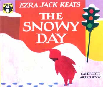
2. Snowy Day.
Inspired by Ezra Jack Keats’ Snowy Day,
we had to illustrate 4 sentences from another book about all four seasons for
young readers. The sentences were really dumb:
Winter is here. Put your boots on. Find
your mittens. You can build a snowman.
Winter is the cold season of the year.
It’s a time for snow shovels and warm woolen scarves.
You can ride downhill on sleds when
snow is on the ground.
You can have a skating party if your birthday
is in winter. Invite all your friends.
I
thought this would be really fun, but I hated it. Everyone hated it. I’m not
sure why, exactly. None of us were finding inspiration. Maybe it was
because we weren't ready to think about snow.
I
went through several rough draft ideas and first sketched out a version with
Asian children because our RISD portfolio requires pieces with multicultural
kids. But after an entire week of sketching, at the first critique, everyone
decided these sketches would confuse a young audience. I can’t find these
sketches either.
I
liked my second set of drafts:
But
at the second week of critiques, my teacher said, “No.” She told me to give the
kids faces. Even though tons of illustrators have enjoyed wild success with
dots-for-eyes:
Holly Hobbie
Shel Silverstein
Marie-Louise Gay
Quentin Blake
Janet Ahlberg
Lane Smith
Chihiro Iwasaki
Russell Ayto
Sigh.
Round
3:
Jesse’s
comment: “Those kids look like androgynous Teletubbies.”
That’s
what everyone else said in the third week of critiques too.
3. Cricket magazine cover. I should have been thrilled to do
this, but I still hadn’t figured out how to solve my Snowy Day problems without
completely starting over and redoing everything.
But we had to move on. To be inspired for Cricket,
we spent one class period in the RISD nature lab. This building has shelves and
cabinets lined with critters that have paid a visit to the taxidermist. There’s
one cabinet full of just owls. There’s a room full of skeletons and nautilus
shells. There’s a “Cabinet of Curiosities” that stores odd things in bottles
with lots of formaldehyde.
We
had to pick an animal and draw it and then the idea was to use the sketch as
inspiration for our magazine cover.
I
hate drawing in front of people, only because I’m not good at it and because
I’ve taken too many shortcuts in life, I don’t draw that well. Which you might
think sounds like baloney, but you should see what my classmates can draw. With
their eyes closed.
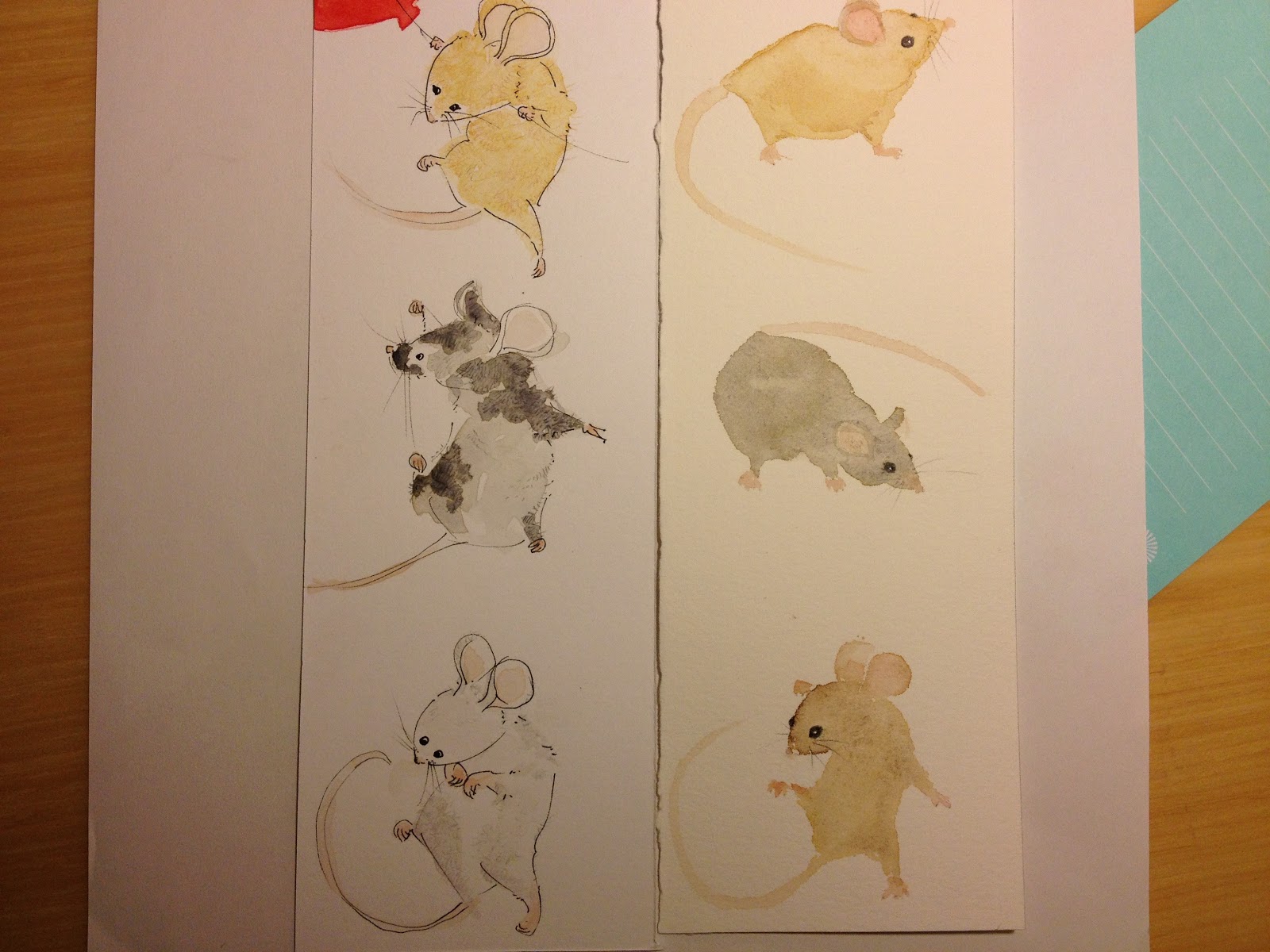
I picked
the tiniest animal in the whole lab:
 |
| a wee mousie |
I
wasn’t in a drawing mood, so I made sure it took the whole 3 hours to create
this masterpiece.
My
first cover sketch looked like this:
Then
I went through 6 other ideas, wondering how I was going to get the desired
effect, because Cricket covers often
have a design that features something eye-catching on the front with a surprise
on the back. Like this:
I went
back to my original idea and drew more crappy mice.
 |
| One of these mice is not like the other... |
***
So, this is why I had to retire from party planning. But friends picked up where we left off and saved us from being hermits. Thank you friends! The final project for Photoshop was to make a movie poster. Friends, I'm sorry I couldn't squeeze all of you onto my poster, just those of you who post pictures on FB that happened to work with my idea. If my life were a movie, it would be called:
The sad end to this story is
that there are so many things I could have done to all of these pieces but I ran out of time. I’ll have to put them away for a year and come back to them
later. Oh well, what do you do?


4 comments:
You seriously amaze me! You are so talented! I love seeing the transitions your work takes!
Keep up the amazing job!
Thanks so much for sharing your art! It's so interesting to see what you go through to get to the end product. When you do write a book, it's going to be amazing. Your drawings are beautiful, with characters that would really engage children!
you are soooooo talented! i mean soooo talented! and i completely agree your character is cuter than fancy nancy!! lots cuter! we should write a story for her....i feel like she is the kinda girl who goes on adventures. maybe she loses something and has to find it? hmm...
Thank you so much for sharing your work here. I have really enjoyed looking at it. You are amazing!!! So talented. I can't wait to see your very own books when they're ready. :)
Post a Comment