My color theory teacher's favorite saying was, “It’s magical!” She used it to describe optical illusions, color in general, and the universe.
During the first week I just
painted a lot of squares in color and black and white. Our first project was to take a color image and paint it in black and white to practice training our eyes to match hues to their intensity and saturation in the achromatic scale. I had to trace the image and transfer it to another piece of paper and then paint it by hand. I hated this project.
Random side note. We learned really useful color trivia, such as:
Germans like their egg yolks darker, so they feed their chickens marigold
petals and paprika, and that fleas in Louis XVI’s palace drove women crazy, but
when one of Marie Antoinette’s favorite shades was named puce (French for
“flea”) the name stuck and triggered a trend that inspired dyers to produce
hues with names like “belly of flea,” “thigh of flea,” and “blushing flea.”
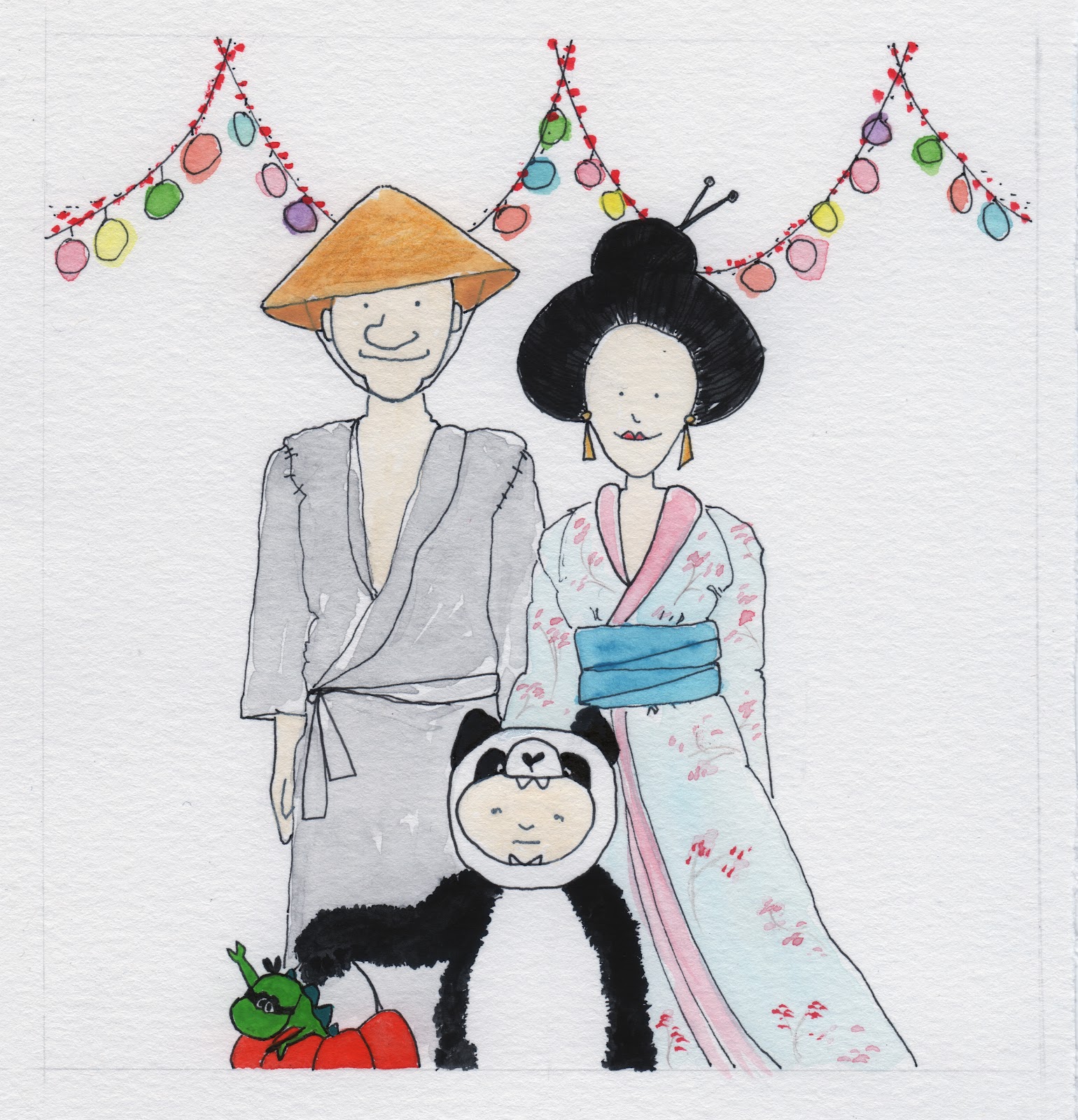
And then we talked about
logo design and why designers use certain colors. We could pick any logo we wanted and
reinterpret the original color usage to convey new meaning, and then somehow
improve upon the original color. I chose the little Utz Girl who appears on bags of chips, pretzels, cheese puffs (a New England
thing) because she started copying my haircut in 1921.
 |
| The original. Dated. Clownish. Geisha. |
 |
| achromatic-no color associations at all, loses some iconic charm of the original. |
 |
| monochromatic-makes it look retro, more graphic. |
 |
| complementary-complements enhance/intensify each other and call to mind sports teams. She looks like a Bronco's cheerleader. |
 |
| polychromatic-this scheme makes things look childlike, and makes me look racist. |
 |
| analogous-makes her look like Barbie's cousin. |
 |
| split complement-yellow green, blue green, red orange. This makes her look like the Jolly Green Giant's adopted child. |
 |
| attempt to improve original-updated color on cheeks to look youthful and less old fashioned and washed out than the original. Yellow stimulates hunger. |
Part of the class work was
to keep a color journal where we collected samples of real world color schemes
in printed material, ads, photos, paintings, etc. We had to look for all the
major color schemes/relationships: primary, triadic, secondary, tertiary,
complementary, achromatic, monochromatic, polychromatic, split-complement,
analogous, etc.
For one section of the color journal
was to observe an object in nature and paint the colors we saw at different
parts of the day. We had to paint the subject at dawn, at noon, at dusk, and at
night. I hated this project.
We talked about color
psychology--how writing with blue pen ink and painting your room blue stimulates creativity and how red and yellow stimulate appetites so they often appear in restaurants, etc. All of this plays a huge factor in determining the names of every paint color you can imagine. For example, the beginning of
the recession marked designers’ renewed efforts to capture consumers’ attention
by distinguishing their brands with names that tell stories, recall memories,
or evoke emotions. So instead of calling beige "beige," companies go for names like toasted bagel because who wants a beige
kitchen? A cooking space accented in toasted bagel is supposedly so much homier. Martha
Stewart has paint with colors called Darkening Sky and Tempest instead of gray and dark gray. Benjamin Moore
has Stormy Sky. Pantone has Turbulence and Tornado. The British company, Farrow
& Ball, offers Dead Salmon (it looks like taupe). We read an article about a
lady who works for Sherwin-Williams and it’s her job to name all their paint colors.
Once she was assigned to finalize 1,000 new paint names (they rename paint
every 10 years). It took six years. The naming process from start to finish
only took 1 ½ to 2 years, but it took longer to do research and collect ideas
from reading magazines, from traveling, and from day to day living to search
for terms relevant to today’s environment. So of course, computer-speak made it
into the final lists—she gave a range of grays names like Chat Room, Virtual
Taupe, Network Gray, Online. Her personal favorite color is called Impetuous.
It’s a 21st-century chartreuse inspired by a color that was popular
in the 50s. I want her job.
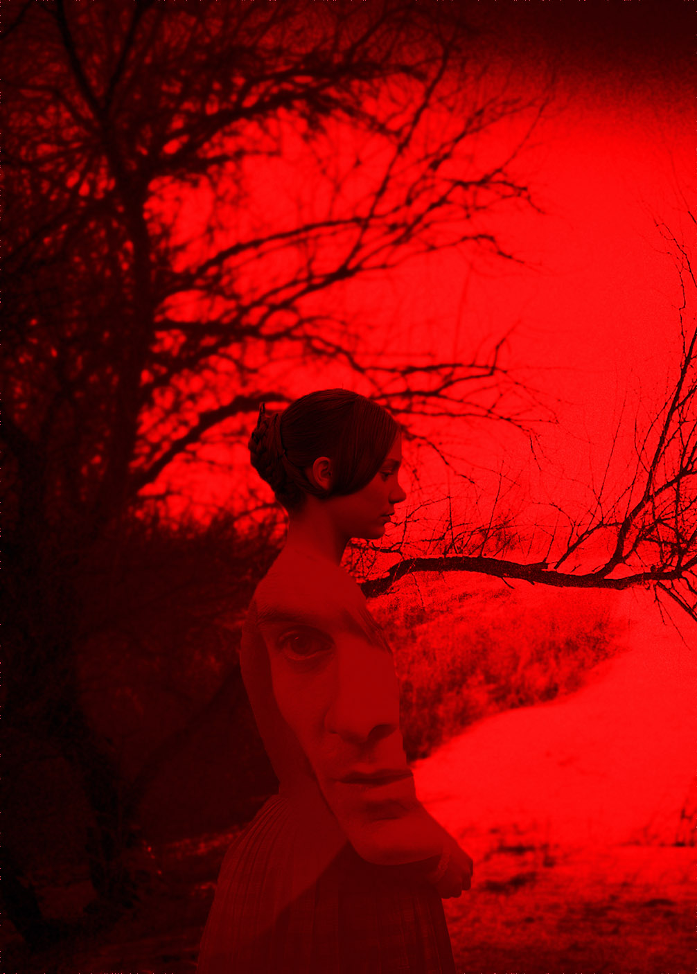
We talked about color usage and had to choose a subject in any medium
and recreate the color in the scene so that it was used to convey different ideas
each time. I found a photo of Jane Eyre and a scary English forest and manipulated them on PhotoShop.
 |
| arbitrary: colors appear to be random, objects are colored differently than they occur naturally |
 |
| emotional: black recalls grief/mourning for all the deaths Jane witnessed as a young girl. |
 |
| complementary: blue and orange might be my favorite complements |
 |
| realistic: these are the original photos but I forgot to paint the tree brown and the grass green and creepy Mr. Rochester's face a flesh color |
 |
| symbolic: Jane got locked in a red room as a punishment when she was little. The red room symbolizes anxiety, trauma, suffering, loss of innocence, her Aunt Reed "infantalizing Jane and forcing her back into the womb to be born again with a new attitude..." |
My favorite assignment was our
color function project. We discussed the four functions of color in nature:
color is used in nature for warning, camouflage, mimicry, and attraction. We
chose a subject to paint in four different settings with each one
demonstrating the four different uses of color.
 |
| warning |
 |
| camouflage |
 |
| mimicry |
 |
| attraction |


2 comments:
I love it! You're supremely talented and don't know how you do it!
I'm so proud of you for putting in the time to do your program. You're very talented.
Post a Comment